Goldman Sachs

From 2006 to 2009 I designed trading tools at Wall Street On Demand, a firm owned by Goldman Sachs, which was also my main client. Two are here: REDI Plus, the desktop app traders use to send and manage orders, and a pair of FX trading tools for currency traders.

Role
Senior Interaction Designer
Company
Wall Street On Demand
Years
2006 to 2009
Users
Equity and FX traders
I made
Screens, wireframes, interaction patterns
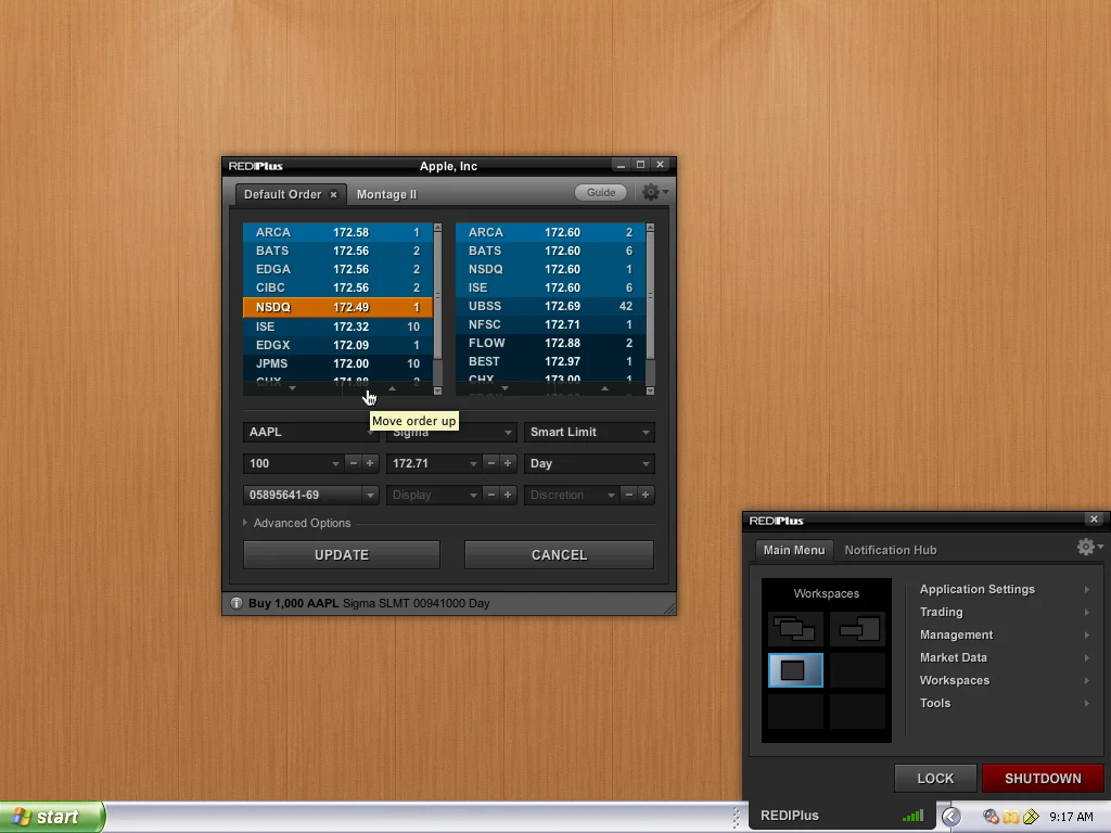
REDI Plus 2009 redesign: a dark order ticket for Apple showing exchange depth on both sides, order fields and Update and Cancel buttons, next to a notification hub with workspaces and Lock and Shutdown buttons.2009
REDI Plus, 2009. An order ticket with live depth from every exchange, and the hub that holds workspaces, settings and notifications.
Project 1

REDI Plus

A redesign of Goldman’s order management app, from the first patterns in 2007 to a new desktop in 2009.

Where it started

Traders keep REDI Plus open all day, next to market data, news and chat. Every order they have working sits in one of its windows, and the one that needs a decision has to stand out from hundreds that don’t.

The app we started from had grown one feature at a time: grey Windows chrome, saturated fills on every row, and a toolbar of small buttons on every window. The redesign started with the quote monitor, the window traders watch most.
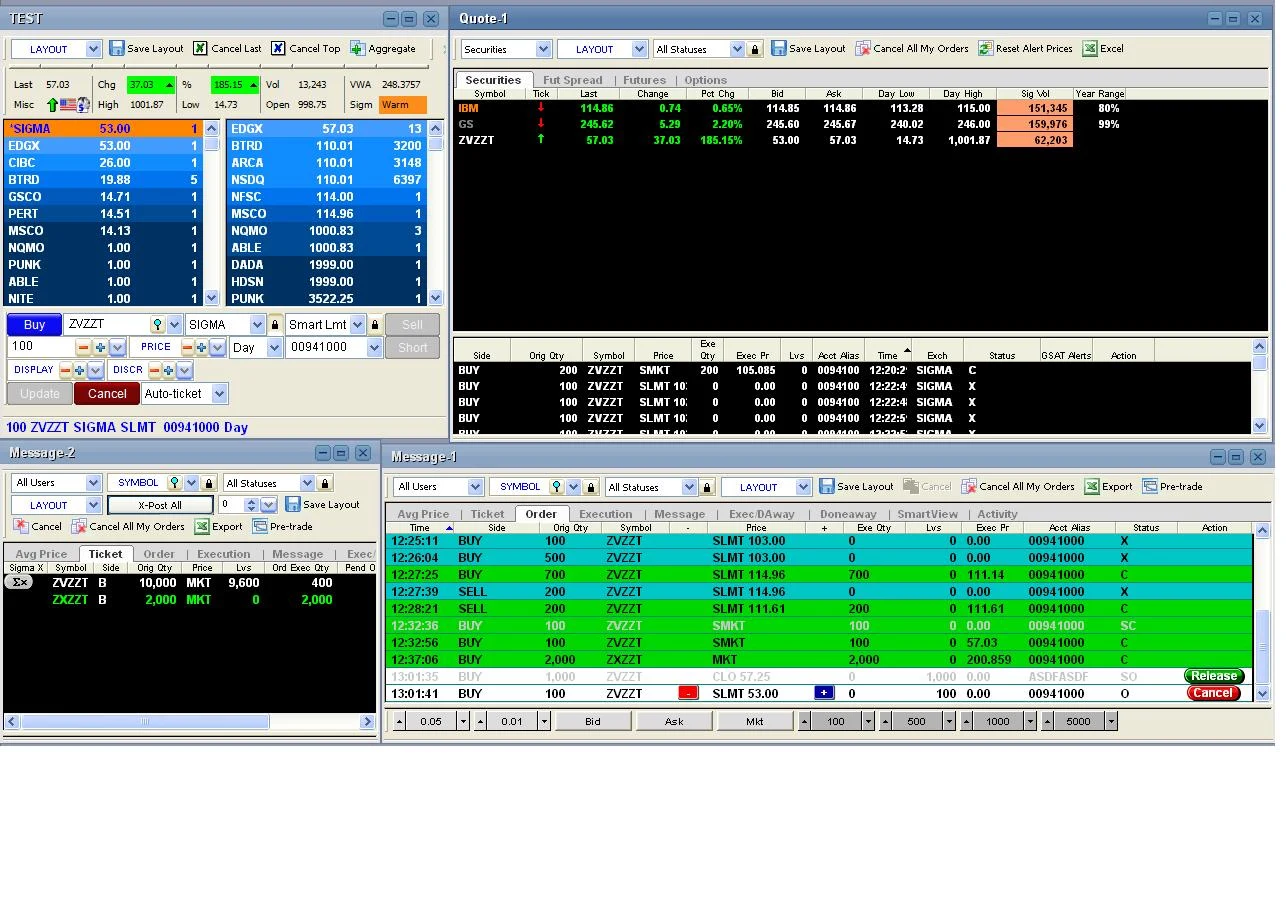
REDI Plus before the redesign: several grey Windows panels with saturated blue, green and orange rows, dense toolbars and small buttons.Before
Before. REDI Plus when the redesign started, from the client’s files.
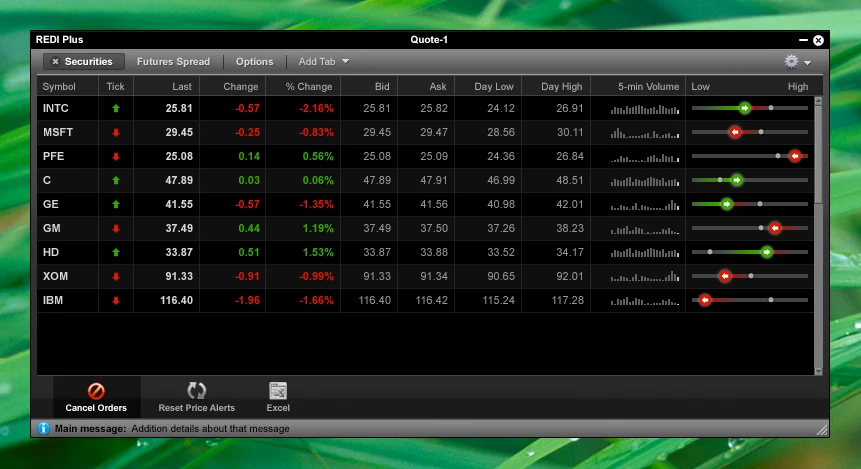
Redesigned REDI Plus quote monitor from October 2007: a dark window listing nine stocks with tick arrows, change, bid and ask, a five-minute volume sparkline and a day-range slider.2007
After, October 2007. One quote monitor: a tick arrow, a volume sparkline and a day-range marker per row.

Rules before screens

A trading app has dozens of windows, so a few good screens weren’t enough. In December 2007 I put the behaviors we had proposed into a design patterns document, so every window would edit, sort and filter the same way.

The goal
“Facilitate direct manipulation of the interface and limit the use of complex dialog boxes or hidden preferences.”

REDI Plus Redesign, Design Patterns, December 2007
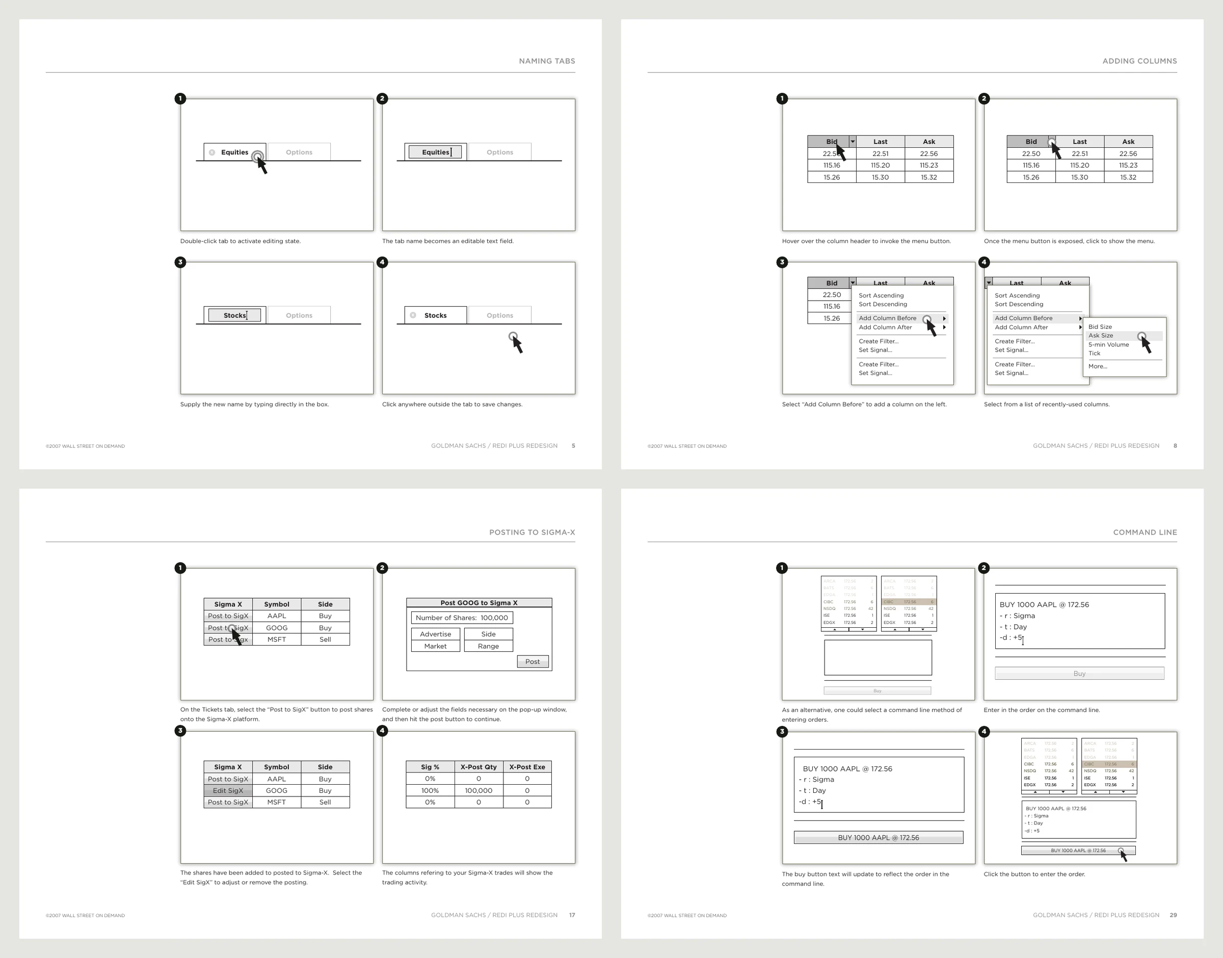
Four pages from the REDI Plus design patterns document: renaming tabs, adding columns, posting orders to Sigma X, and entering an order from the command line, each shown as numbered step-by-step frames.Patterns
Design patterns, December 2007. Each behavior drawn step by step: renaming a tab, adding a column, posting to Sigma X, entering an order by command line.
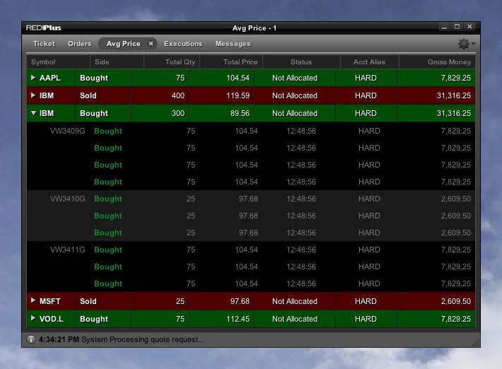
Average price window from December 2007: bought and sold rows in green and red, with one IBM row expanded to show the individual fills underneath.2007
Average price. Fills roll up into one row per order and open on demand.
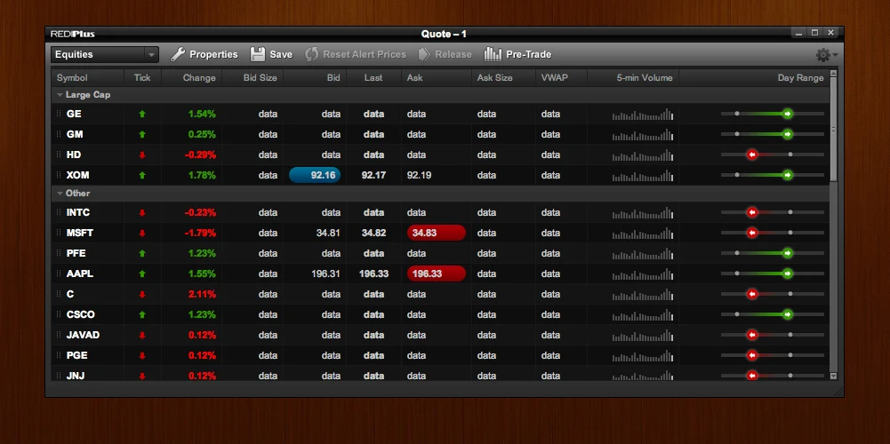
Quote monitor in the carbon theme: stocks grouped into Large Cap and Other, with price changes flashed in blue and red pills.2007
Carbon theme. Grouped symbols, and price changes that flash only the cell that moved.

The 2009 desktop

In 2009 the work moved from single windows to the whole desktop: a toolbar that docks to the screen, a hub for workspaces, notifications for executions that fail, and action bars traders can lay out for themselves.

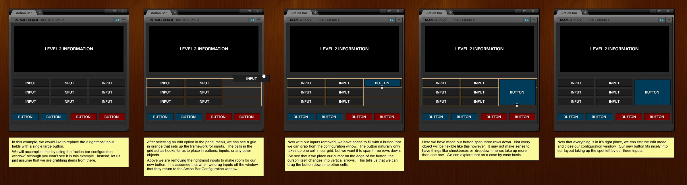
For the action bars I drew the interaction as a storyboard, with notes under each frame, so Goldman’s developers could see how a button grows to fill the space three inputs used to take.
Five-frame storyboard of an action bar being edited: inputs are removed from the grid, a button is dropped in, stretched to span three rows, and the edit mode is closed, with a yellow note explaining each step.Storyboard
Configuring an action bar, 2009. Five frames and five notes, from removing inputs to a button that spans three rows.
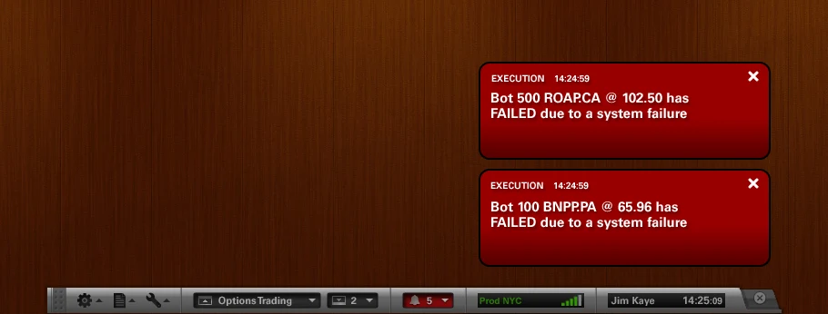
Two red execution notifications reading that orders have failed due to a system failure, stacked above the REDI Plus toolbar.2009
Failed executions. Alerts stack above the toolbar until the trader dismisses them.
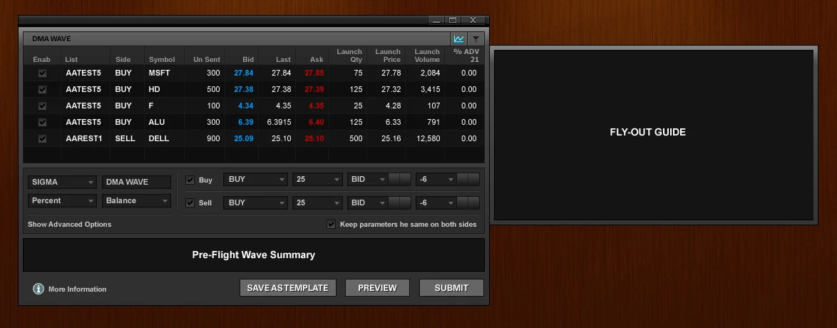
DMA Wave tool: a table of five orders with bid, last and ask, wave settings for buy and sell sides, and a pre-flight summary with Preview and Submit buttons.2009
Wave tool. Send a list of orders in waves, with a pre-flight summary before anything goes out.
Project 2

FX trading tools

The FX Trader’s Toolkit and REDI FXEdge: currency trading where prices move every second.

FX Trader’s Toolkit

An FX trader works many currency pairs at once and reads the market from the price ladder: the best bid and offer in large type, the levels around them, and the size waiting at each one.

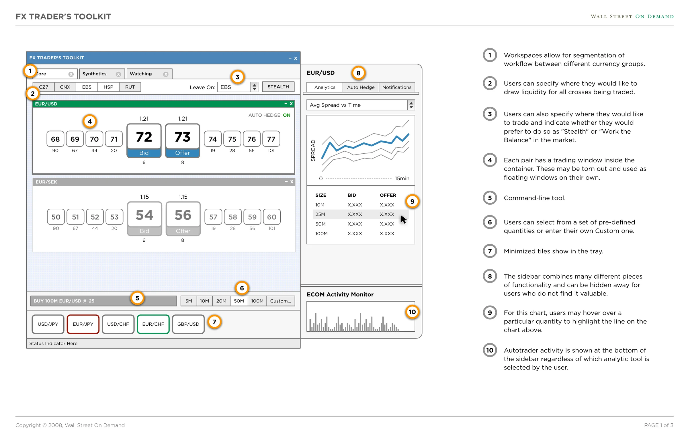
The first wireframes, in April 2008, set up the structure with numbered notes. Pairs live in workspaces, each pair gets its own trading window, and a sidebar holds the analytics.

Wireframe note 3
“Users can also specify where they would like to trade and indicate whether they would prefer to do so as ‘Stealth’ or ‘Work the Balance’ in the market.”

FX Trader’s Toolkit wireframes, round 1, April 2008

Wireframe note 4
“Each pair has a trading window inside the container. These may be torn out and used as floating windows on their own.”

FX Trader’s Toolkit wireframes, round 1, April 2008
FX Trader’s Toolkit wireframe with ten numbered orange markers and matching notes: workspaces, liquidity sources, stealth trading, tear-out pair windows, a command line, quantity presets, minimized tiles and an analytics sidebar.Wireframe
Wireframes, round 1. Ten numbered notes, from workspaces to the autotrader activity monitor.
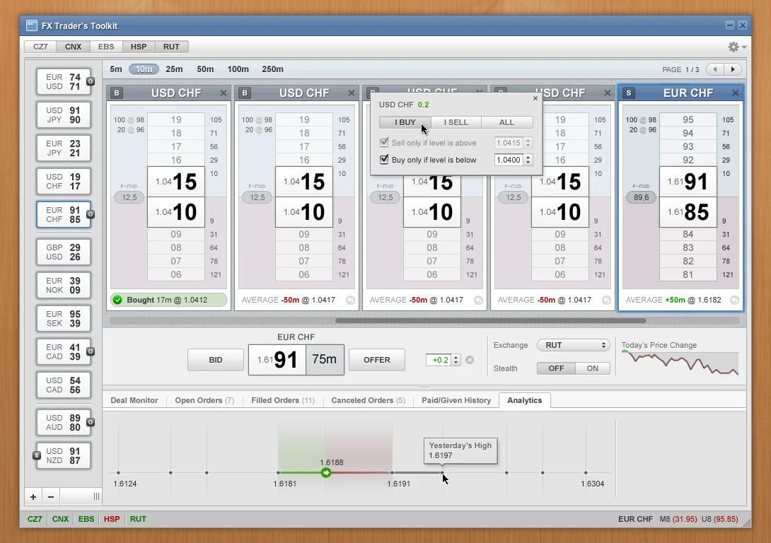
FX Trader’s Toolkit visual design: five price ladders for USD CHF and EUR CHF with large bid and offer prices, a buy and sell popover, and an analytics chart showing today’s high.Visual
Ladders. Five pairs side by side, with the big figure and the pips that move set apart.
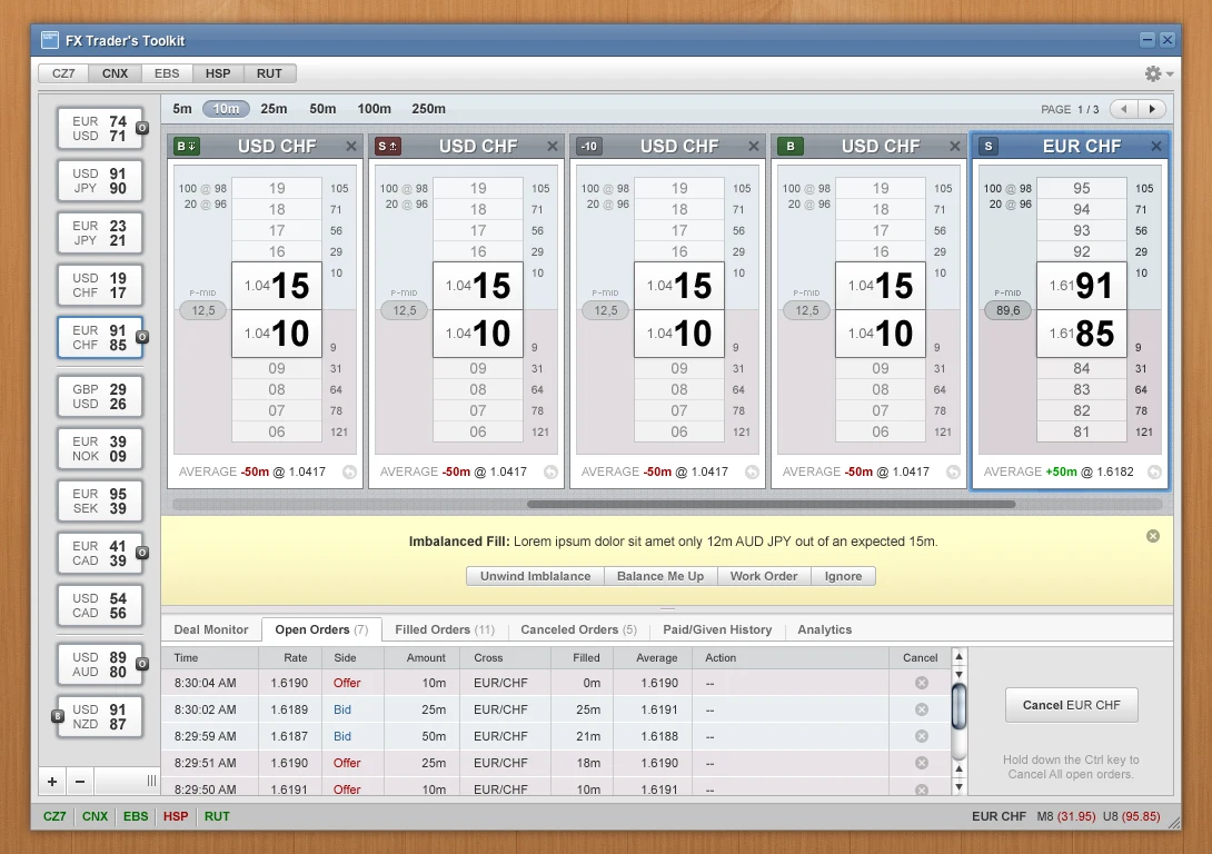
The same toolkit with a yellow Imbalanced Fill warning offering Unwind Imbalance, Balance Me Up, Work Order and Ignore, above a table of open orders.Visual
Imbalanced fill. When a fill comes back short, the four ways out sit in the warning itself.

REDI FXEdge

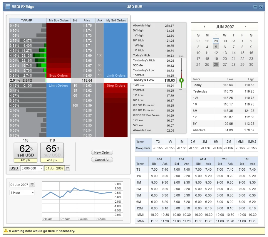
FXEdge was Goldman’s interface for trading currencies, the FX counterpart to REDI, and it got the same depth of design work: spot, swaps and options for major and emerging-market currencies, and an order ladder that shows where the trader’s own stop and limit orders sit in the market.
REDI FXEdge USD EUR order ladder: a time-weighted depth column, buy and sell orders in blue and red around the current price, a table of historical highs and lows, a calendar, swap points and an options volatility grid.FXEdge
Order ladder. Your stop and limit orders drawn around the live price, with the history, swaps and volatility for the pair beside it.
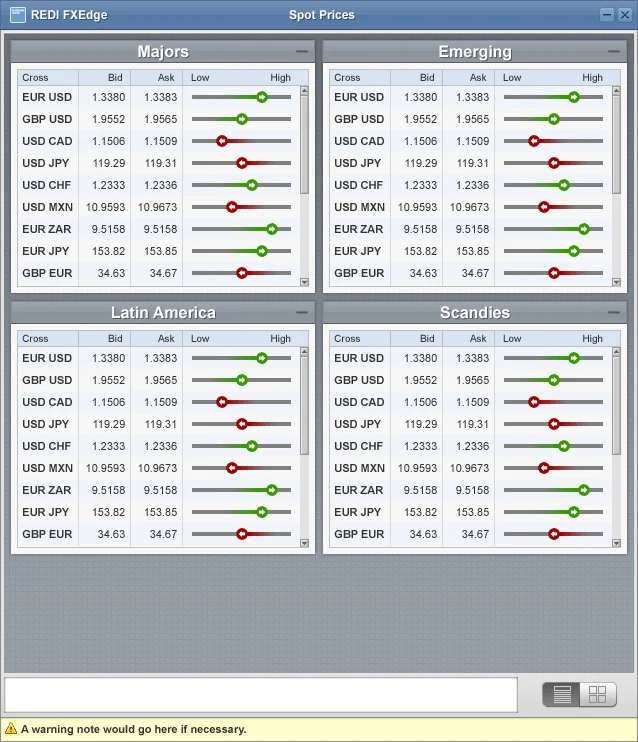
REDI FXEdge spot prices for four currency groups, each row showing bid, ask and a slider marking where the price sits in the day’s range.FXEdge
Spot prices. Four regions, each row with its place in the day’s range.
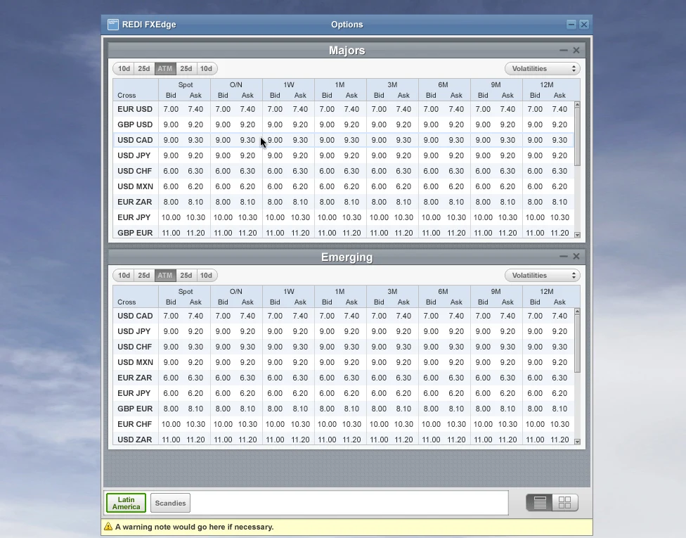
REDI FXEdge options grid for majors and emerging currencies, with bid and ask volatilities from overnight to twelve months.FXEdge
Options. Volatility by tenor, majors above emerging markets.

What carried forward

Goldman was where I first designed dense professional tools, and the problem hasn’t changed since. At Aspen Mesh, at Cloudflare and on operator interfaces at SMX, the job is still to help someone find the important thing fast, and I still write down the rules and build the prototype to get there.