 2022
2022A map of the dashboard
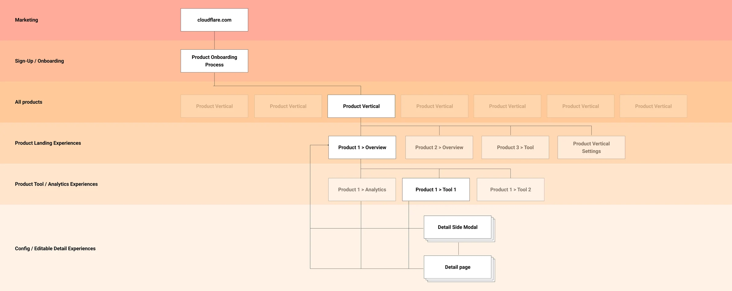
A roadmap for one set of levels across every product, from sign-up to the page where a setting gets changed.
Every product, the same levels
The Cloudflare dashboard holds dozens of products, from DNS and security to Workers, and each one is built by its own team. Without a shared shape, every product invents its own navigation and a developer has to relearn the dashboard each time they move between them.
I proposed a roadmap built on the levels every product passes through: from cloudflare.com and sign-up, to the list of all products, a product’s overview, its tools and analytics, and the side panels and detail pages where things get edited. With it, a team adding a page could see which level the page belonged on and what sits above and below it.
 Map
MapLoad Balancing
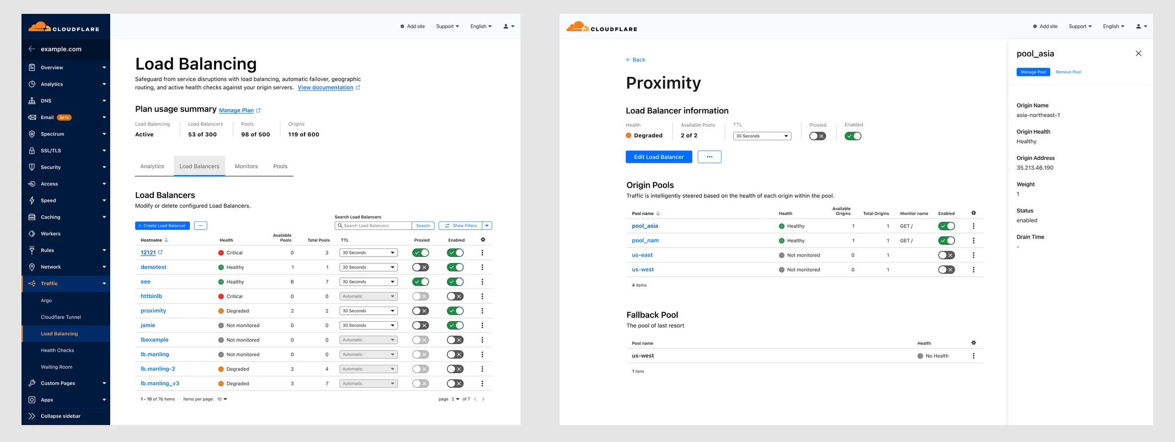
I worked Load Balancing through the map, with load balancers, pools and monitors each getting their own list and detail pages.
 2023
2023Workers overview
The first page developers see when they open Workers, Cloudflare’s serverless platform.
Where it started
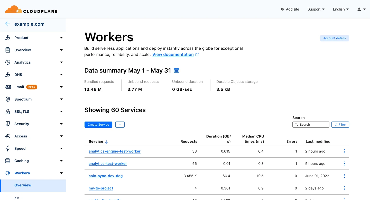
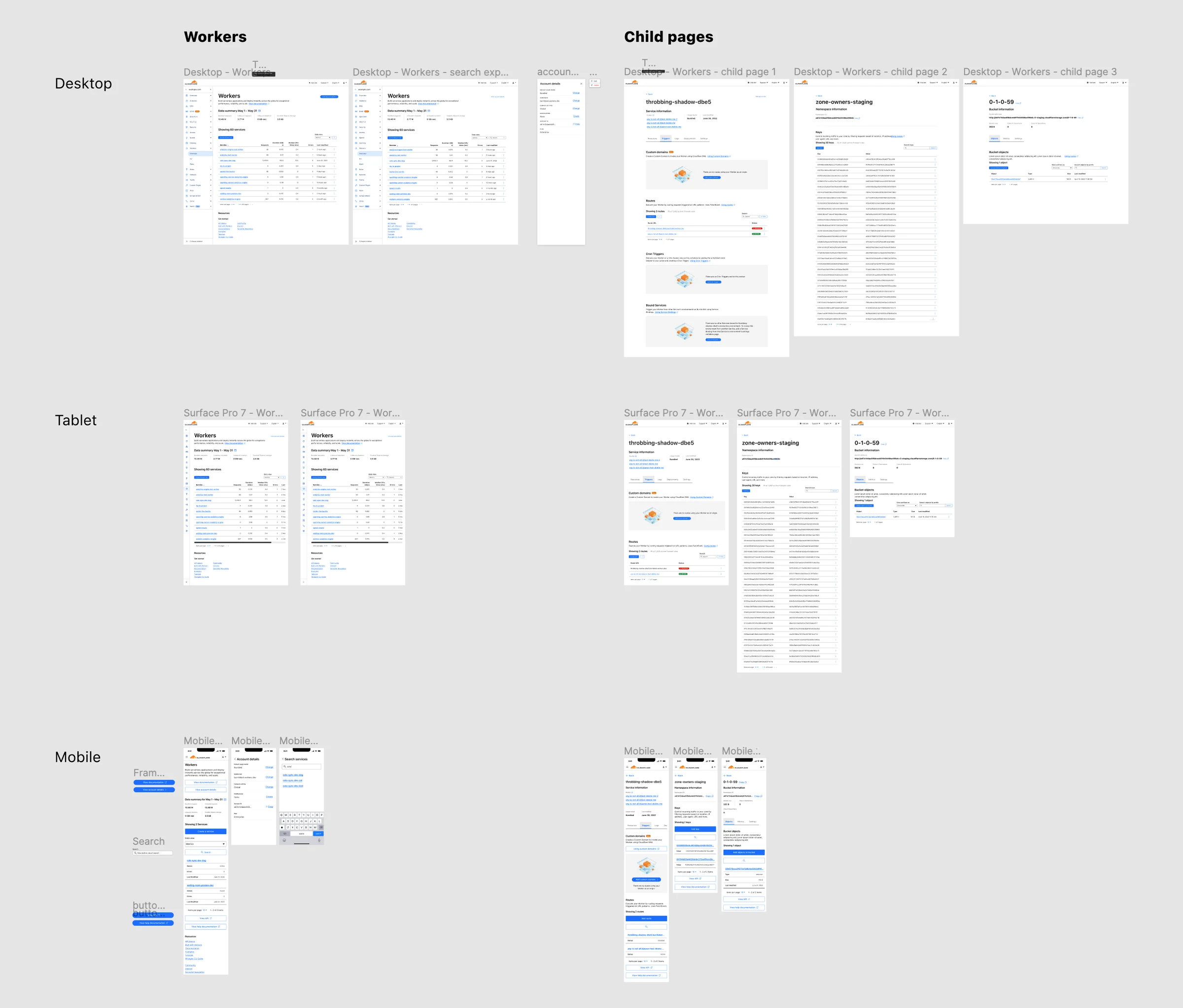
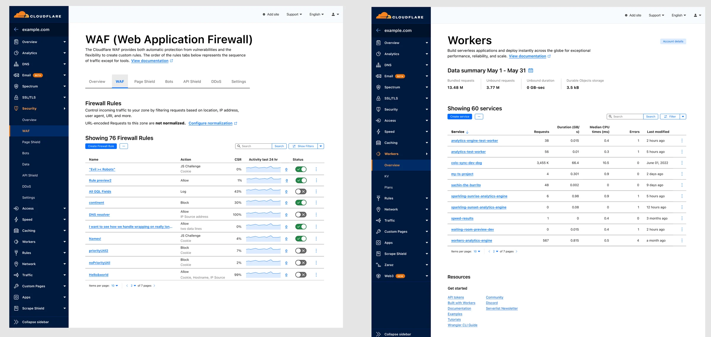
The overview showed each service as a card, with usage, account settings and links stacked in a column beside them. Requests, errors and CPU time only appeared for services with recent traffic, so comparing services meant scanning card by card. The screen below is that layout, cleaned up so it compares fairly with the redesign.
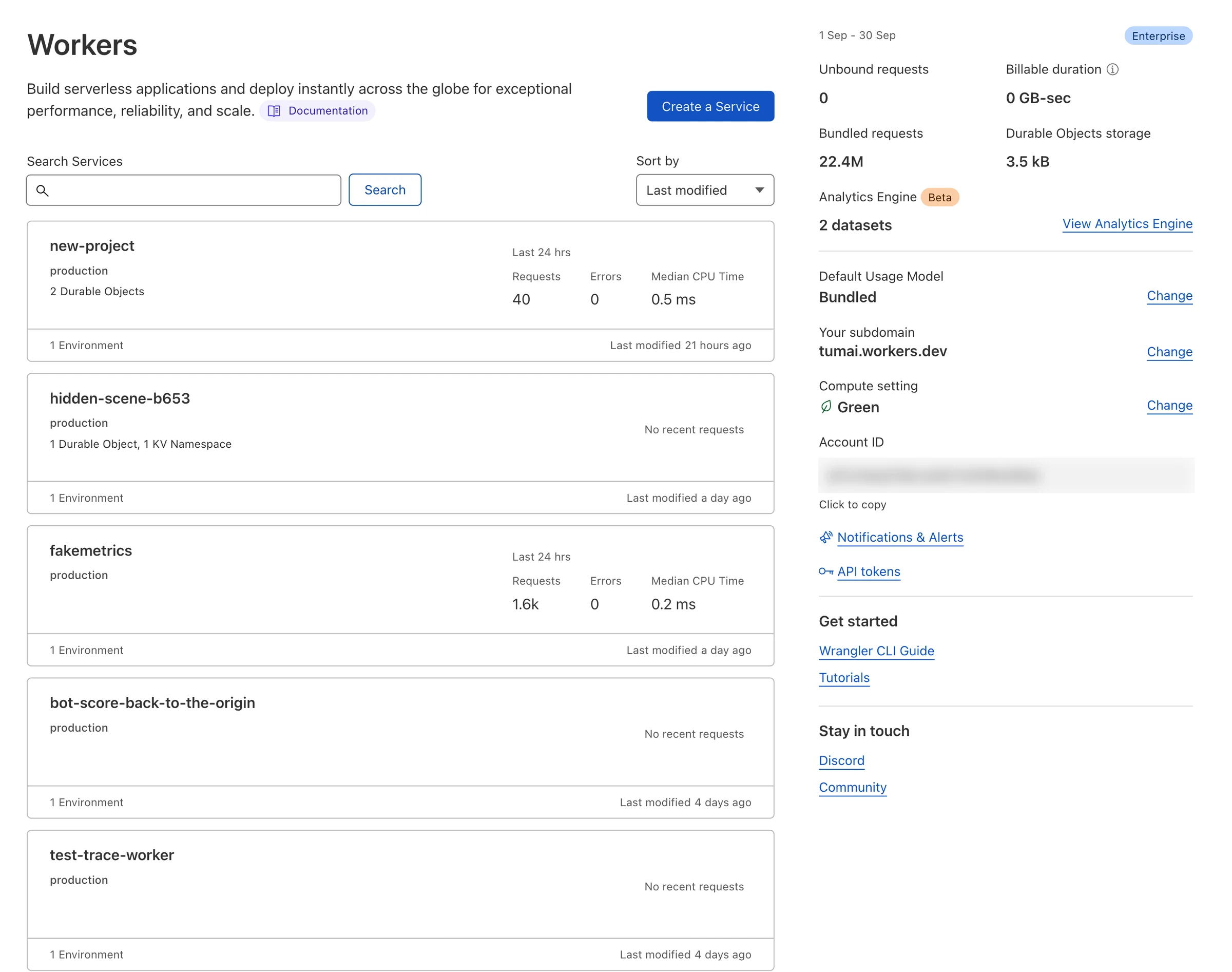 Before
One table, three sizes
The redesign puts the month’s usage in a row across the top and every service in one table, with requests, duration, CPU time and errors in columns a developer can sort. Resources and guides move to the bottom of the page.
I drew it at desktop, tablet and phone sizes, along with the pages a service, a KV namespace and a storage bucket open into. On a phone, each row of the table becomes a short card with the numbers that matter most.
 Figma
FigmaComponent library
An internal React and Figma library to bring dozens of inconsistent products onto the same parts.
Built from the same parts
Every product in the dashboard’s left nav had grown on its own, with its own tables, forms and buttons that looked and behaved differently. My team built one component library in React and a matching library in Figma, so every product team could build from the same parts. It was fully internal and never had a public name.
Teams adopted the components product by product, and were starting to replace the hardest pieces, like data tables, with the shared versions. The 2022 button takes its height from the baseline grid and its padding from the base unit, so it lines up with the text and inputs around it on any page.
I also led an accessibility audit of the dashboard. Every issue was tracked to the page it affected and checked again after the fix shipped, so a fix that missed came back as a new ticket instead of being marked done.
 2023
2023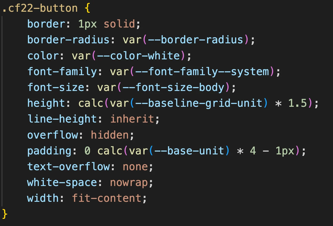 Code
CodeWhat carried forward
At Cloudflare I worked at both ends at once: the map of the whole dashboard and the code for a single button. I still work that way at SMX, where the operator screens and the components they’re built from get designed together.