 Rally
RallyAgile Central
Rally’s tool for planning sprints and tracking work, and the product the shared components were first built for.
Tracking a sprint
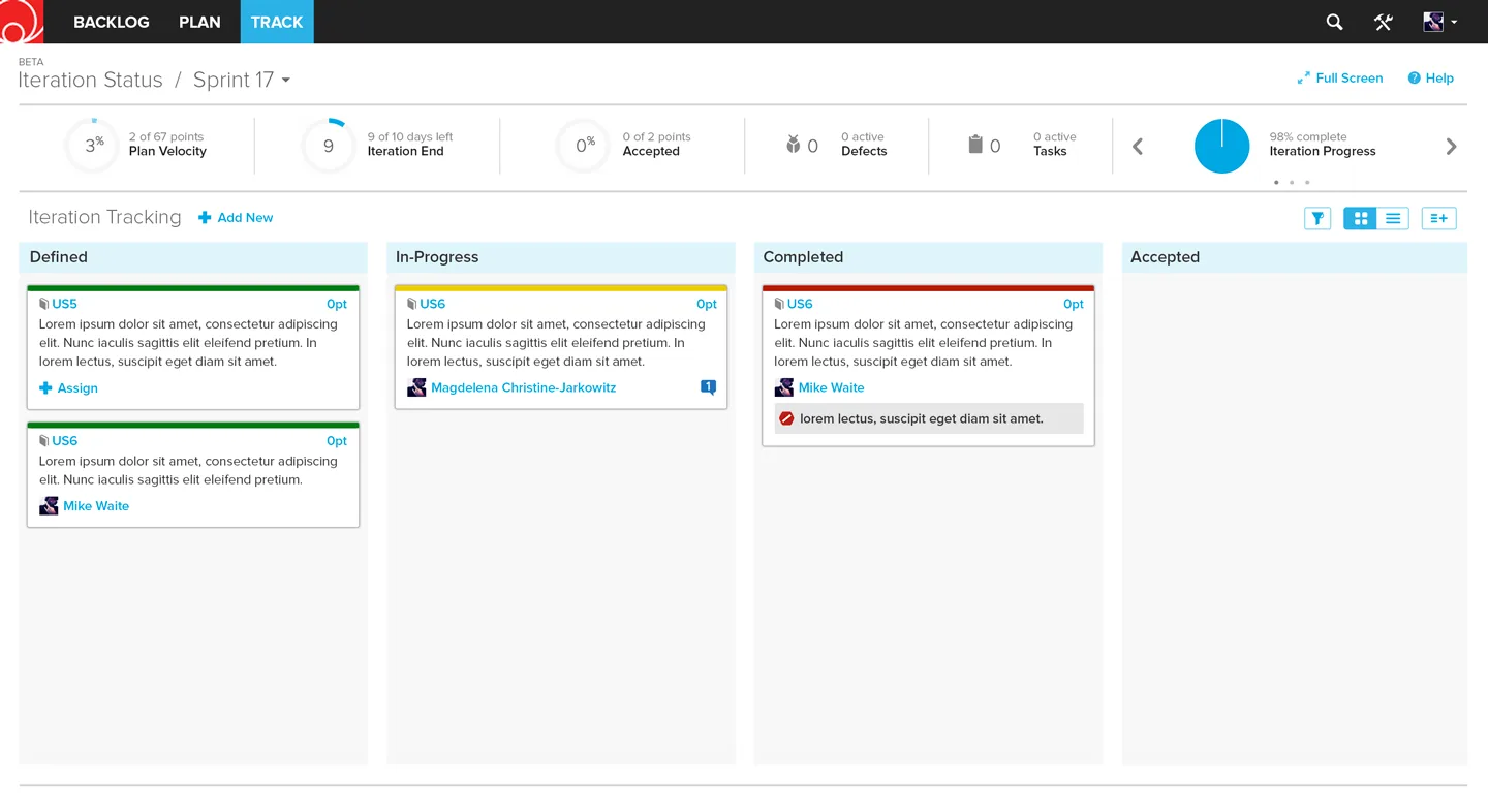
Software teams use Agile Central to plan a sprint and move each story from Defined to In-Progress, Completed and Accepted. The iteration status page puts the numbers a team checks every morning across the top: velocity, days left, accepted points, defects, tasks and overall progress.
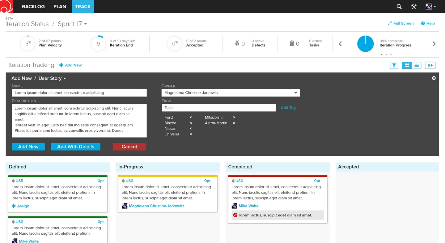
Adding work happens in place. The Add New panel opens over the board, so a story gets its name, owner and tags without the team leaving the sprint.
 Rally
Rally Grid
Grid Rally
RallyMineral UI
A React component library for every product at CA, built on what we learned in Agile Central.
Sombrero first
Before Mineral there was Sombrero, the internal component library we built for Agile Central. By April 2017 every new page in Agile Central used it, and teams had been shipping the same button, dropdown and select for over a year. That let them spend their time on the parts of the product that were actually different.
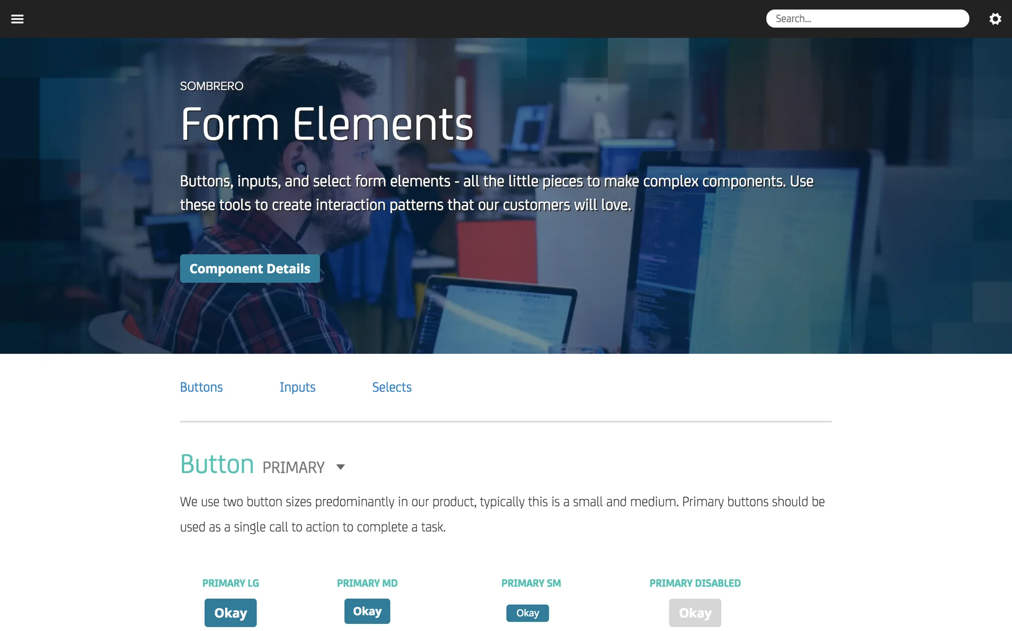 Sombrero
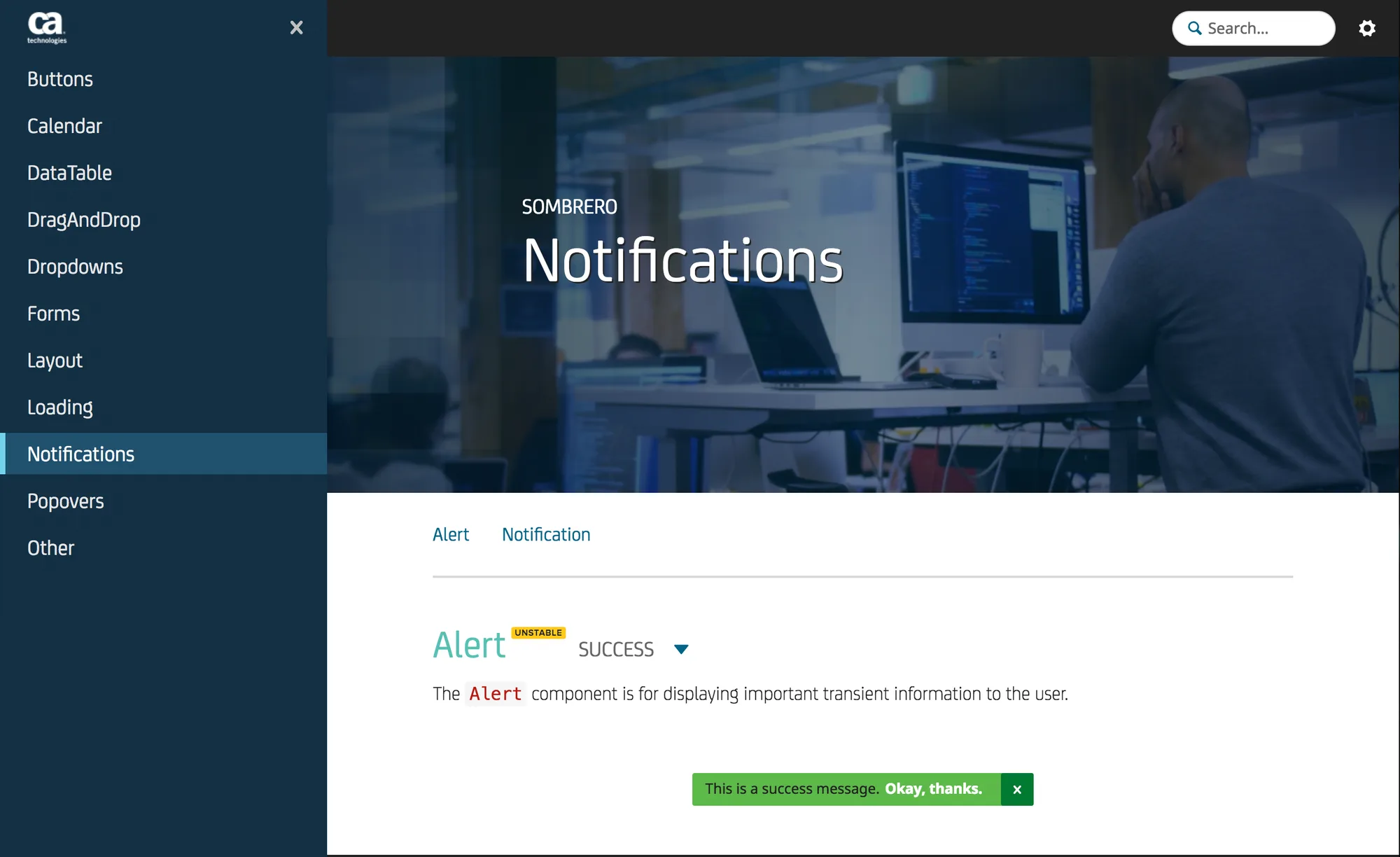 Sombrero
Code, not a document
For its 2018 fiscal year, CA set the design team a goal to make good UI easy to deliver, and I took the component library. CA already had a design language, the EDL, but it was a document. In April 2017 I told the design organization that Mineral would be something developers could install.
“This isn’t the EDL. Mineral UI will be actual code that developers can use to build buttons, dropdowns, modals, etc. that make up our products.”
Mineral UI Vision & Roadmap, April 2017
“Consistency becomes a by-product, not a mandate.”
Mineral UI Vision & Roadmap, April 2017
The repository went up on GitHub that month. We set it up like a product: public code, automated builds, each component published as its own package and version, and a website with examples and documentation for every component. I drove the component library and the component pages of the site. A colleague drove the style guide the components follow.
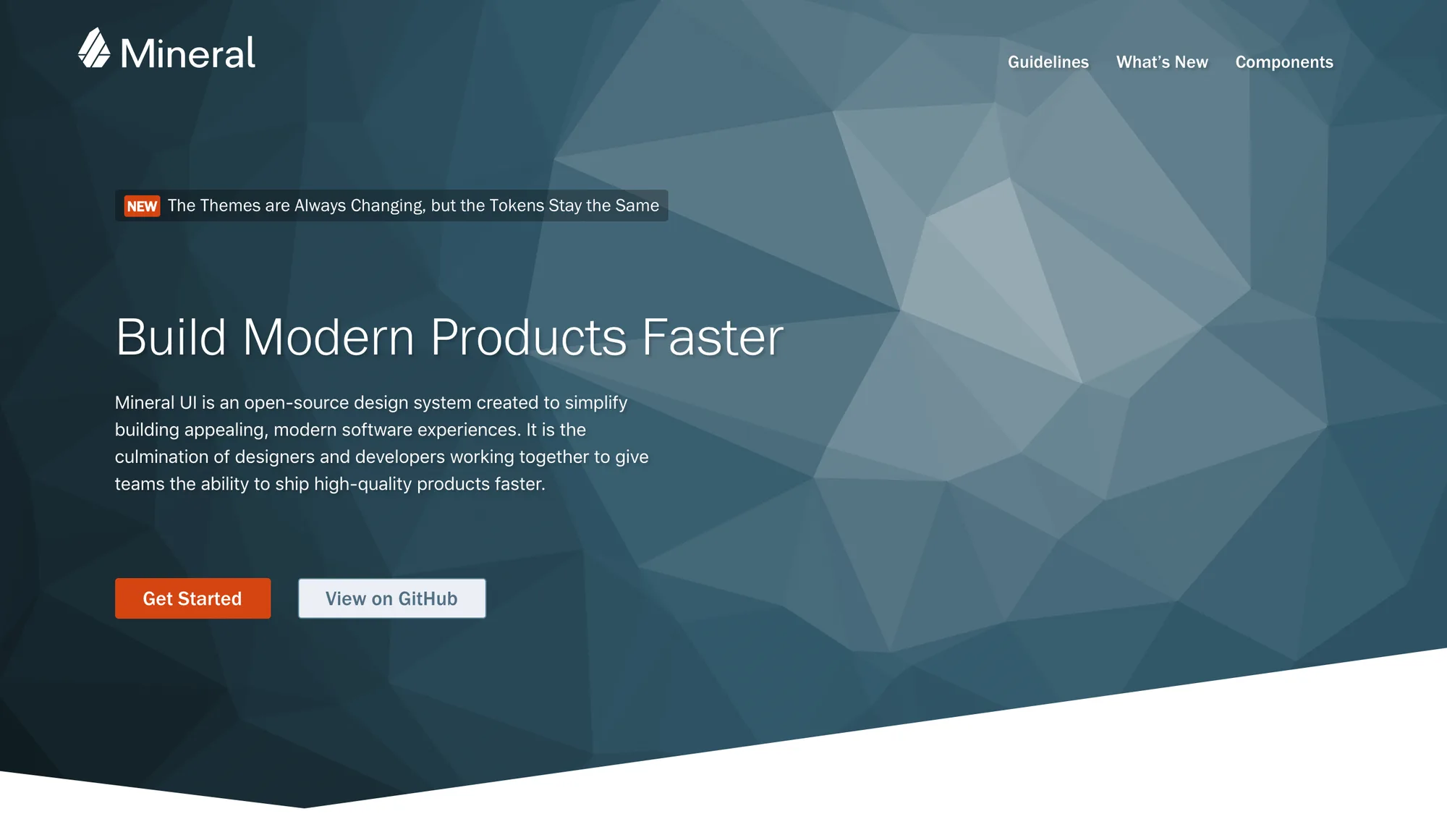 Mineral
Built in from the start
Accessibility was part of every component rather than a later pass: color with checked contrast ratios, standards-compliant markup, and testing with assistive technology. Each component was self-contained, so a team could drop it into a React app without breaking the styles around it.
Theming ran on design tokens. A product could change its fonts and colors, or white-label the whole interface, without forking a single component.
Getting it used
A library only counts when products ship with it, and that was the harder job. Product managers had features to deliver, designers disagreed, and most teams were short on front-end developers. Into 2018 I worked with groups across CA, including the mainframe division, on which library each of their React and Angular products should use.
In November 2017 I wrote about what I was learning in Change Is the Real Value of a Design System.
“The design of our products is what is in our products.”
Change Is the Real Value of a Design System, November 2017
What carried forward
The code is public on GitHub. What I took with me is the habit of designing the product and the parts it’s built from together. I did it again at Cloudflare and at SMX, because the fastest way to change how a product looks and works is to change the code its teams build with.