Selected workMore work

More Work

Two pitches and a current side project: Betfair Predictions, prototypes that turned betting odds into charts about the news, PGA TOUR, one way to follow a tournament across four screens, and a tech pack builder that turns a fashion design into the build a factory needs.

Years
2008, 2011 to 2012, 2025
Work
Pitches for Betfair and PGA TOUR, a side project
I made
Prototypes, data visualization, mobile and tablet concepts, a working tool
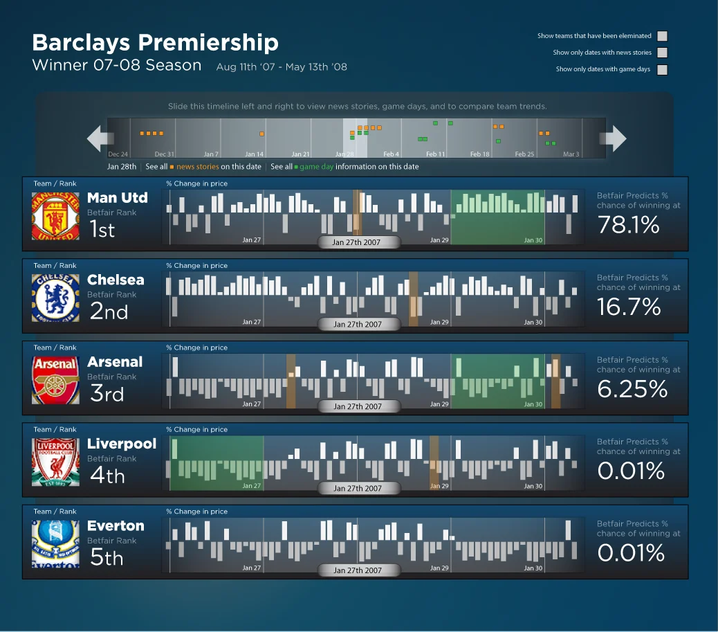
Betfair Predicts, Barclays Premiership winner for the 2007-08 season: a timeline slider of news stories and game days across the top, and a row for each of Man Utd, Chelsea, Arsenal, Liverpool and Everton with bars of daily price change and the chance of winning, from 78.1% for Man Utd down to 0.01%.2008
The title race as a market. Each club’s chance of winning the 2007–08 Premiership, with the news and game days that moved it.
Project 1

Betfair Predictions

A pitch I made on my own at Wall Street On Demand: prices from a betting exchange, used to tell the story behind an election or a season.

Odds as data

Betfair is a betting exchange. People bet against each other rather than against a bookmaker, so the price on an outcome is the crowd’s own estimate of how likely it is. In early 2008 I pitched Betfair Predictions, a site that used those prices to cover politics and sport, and designed every screen of it.
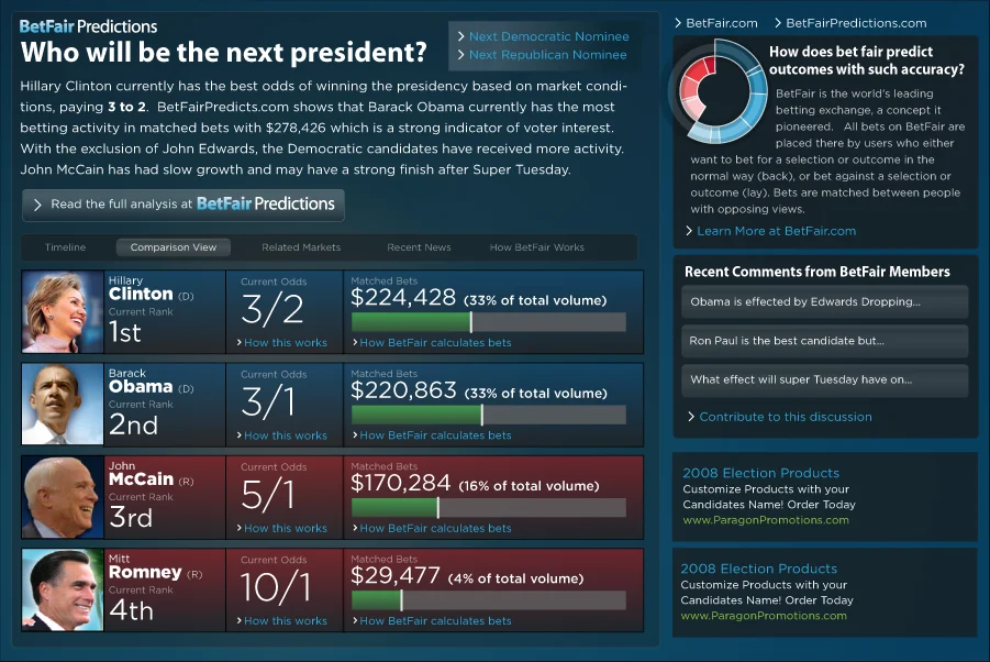
BetFair Predictions page asking Who will be the next president? A ranked list of Hillary Clinton at 3/2, Barack Obama at 3/1, John McCain at 5/1 and Mitt Romney at 10/1, each with the money matched on them, beside a ring chart and recent member comments.Feb 2008
The first prototype. The 2008 presidential field ranked by odds, with the money matched on each candidate and what members were saying.

The chart explains itself

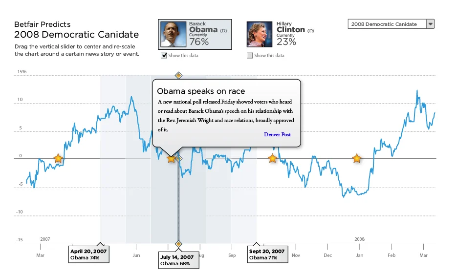
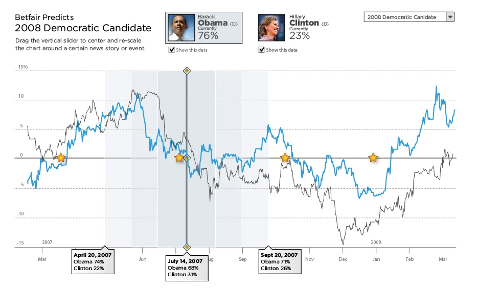
A line of odds only gets interesting when you know why it moved. The candidate chart marks each news story with a star on the day it broke. Drag the slider to a story and the chart re-centers around it, and the story opens in place. Turn on a second candidate to compare them on the same scale.
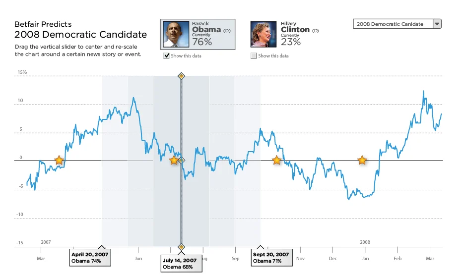
Betfair Predicts 2008 Democratic Candidate: a line chart of Obama's odds from March 2007 to March 2008, with star markers for news stories and a vertical slider centered on July 14, 2007.2008
Stars for stories. Each star is a news story on the day it broke.
The same chart with a callout titled Obama speaks on race open over the slider, summarizing a poll released after the speech.2008
The story in place. Move the slider to a star and the story opens on the chart.
Comparison view: Obama's line in blue and Clinton's in gray on the same chart, with date labels below showing both candidates' chances on three dates.2008
Comparison view. Obama and Clinton on one scale, with both chances read out at each marked date.

A new prototype every week

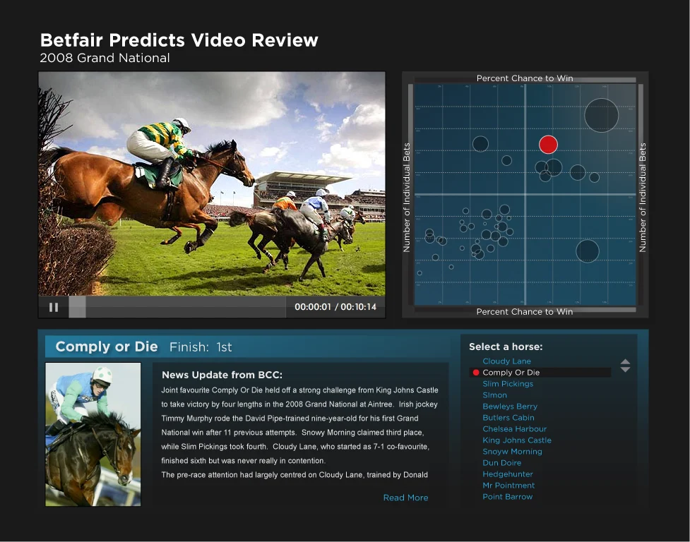
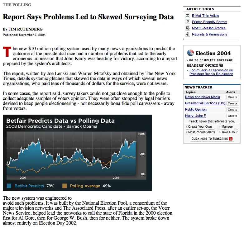
From late March to mid April the work ran in weekly rounds, each one a new sport or a new way in. The Premier League title race got a timeline of news and game days. A world map showed where the bets came from. The Grand National got a video review with every horse plotted by its chance and the number of bets on it. And the odds went out to other sites, as charts set into news articles and sparklines next to a candidate’s name.
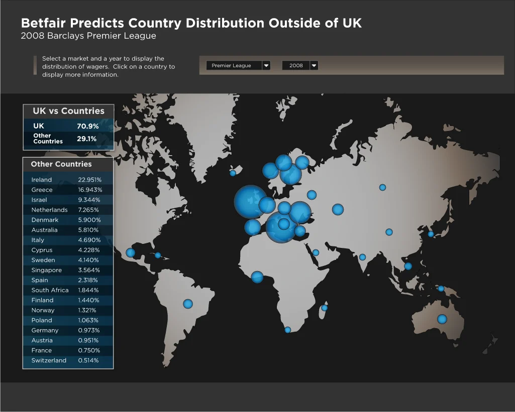
Betfair Predicts Country Distribution Outside of UK for the 2008 Premier League: a dark world map with blue bubbles sized by share of wagers, and a table listing Ireland, Greece, Israel, the Netherlands and other countries by percentage.Apr 2008
Where the money came from. Bets on the Premier League from outside the UK, by country.
Betfair Predicts Video Review for the 2008 Grand National: a race video beside a scatterplot of percent chance to win against number of bets, with one horse highlighted in red, and a news update for the winner, Comply or Die.Apr 2008
Grand National review. The race video next to every horse, plotted by its chance and the bets on it.
A newspaper article about polling problems with an embedded chart titled Betfair Predicts Data vs Polling Data, showing Betfair's odds for Barack Obama against the polling average.Apr 2008
Odds next to the polls. A chart for news sites, with Betfair’s numbers against the polling average.
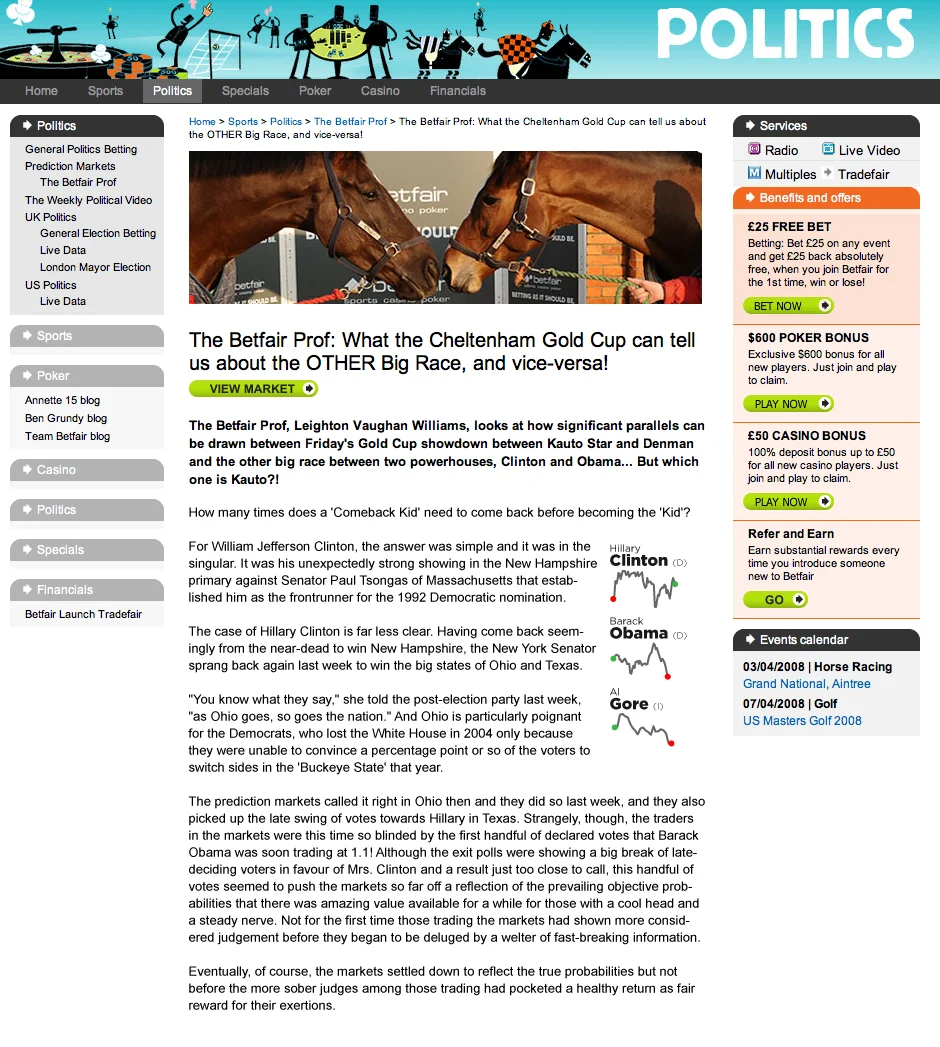
A Betfair politics column comparing the Cheltenham Gold Cup to the Clinton and Obama race, with small sparklines of each candidate's odds beside their names in the text.Apr 2008
Sparklines in the text. Each candidate’s odds as a small line beside their name in a column.
Project 2

PGA TOUR

A pitch for one way to follow a tournament, carried across the iPad, the iPhone, the TV and a magazine.

Shot by shot

Shot Tracker draws every shot on the hole as it happens, with the play-by-play, the player’s numbers for the round, and live comments from fans watching the same hole. On the iPad it shares the screen with video and the leaderboard. On the iPhone it gets a tab of its own, next to news, stats, video and live scoring.
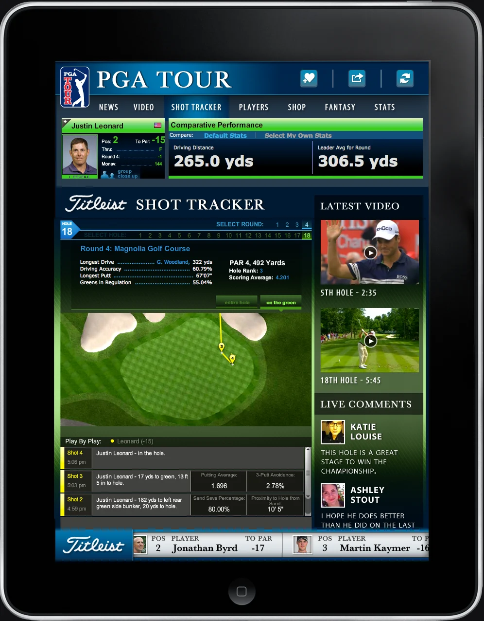
PGA TOUR iPad app on the Shot Tracker tab: Justin Leonard's driving distance against the round leader, a hole diagram with his shots drawn in yellow, latest video clips, live comments, and a play-by-play list.iPad
iPad. The hole, the video and the leaderboard on one screen.
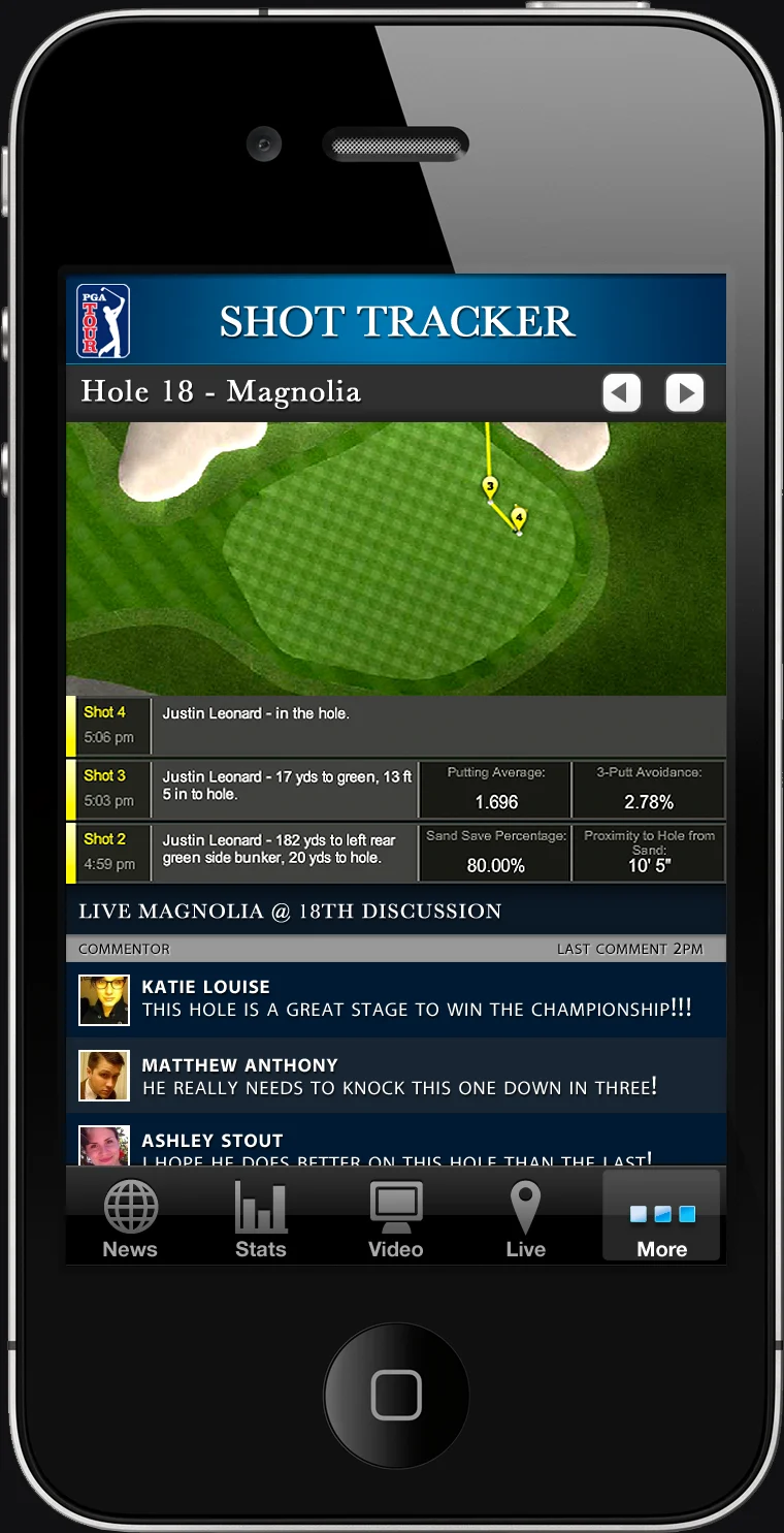
iPhone Shot Tracker for Hole 18, Magnolia: the green with shots drawn on it, a list of Justin Leonard's shots with putting and sand save stats, and a live discussion below.iPhone
iPhone. One hole at a time, with the fans watching it.
iPhone player page for Phil Mickelson: a photo strip of players, his latest news headlines, an ad, and the HSBC Champions leaderboard for round 4.iPhone
Player page. Swipe between players for their news and where they stand.

Past the phone

The same tour went to the living room as a ticker under live coverage, and to the iPad as a monthly magazine.
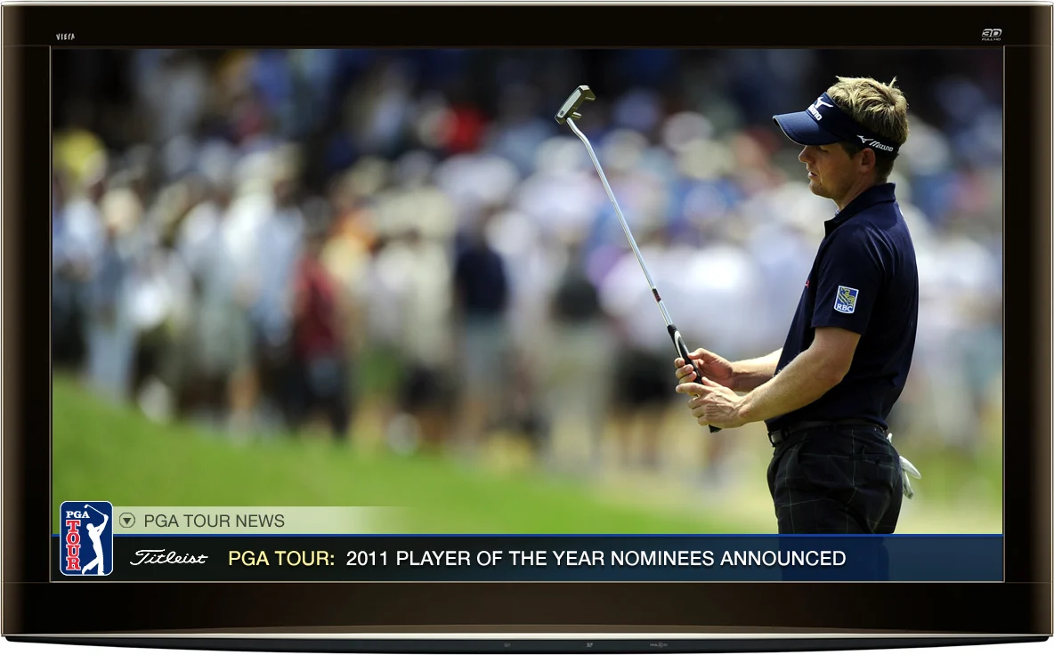
A TV showing a golfer on the green with a PGA TOUR news ticker along the bottom announcing the 2011 Player of the Year nominees.TV
TV. Tour news as a ticker under the coverage.
PGA TOUR magazine cover on an iPad, June 2012: Phil Mickelson, the headline Phil saving the world of golf, and 17 tips to improve your swing.Magazine
Magazine. A monthly issue made for the iPad.
Project 3

Tech Pack Builder

A side project for my wife, a fashion designer. Drop in a design and get the build a factory needs.

Sketch to build

A tech pack translates a design into what a producer needs to make the physical garment: every fabric and trim, where each one goes, how it’s sewn, and how it measures. Drop in an image of the design and the tool writes the build.

The screens below are the real app, run with a jacket I drew for this page.
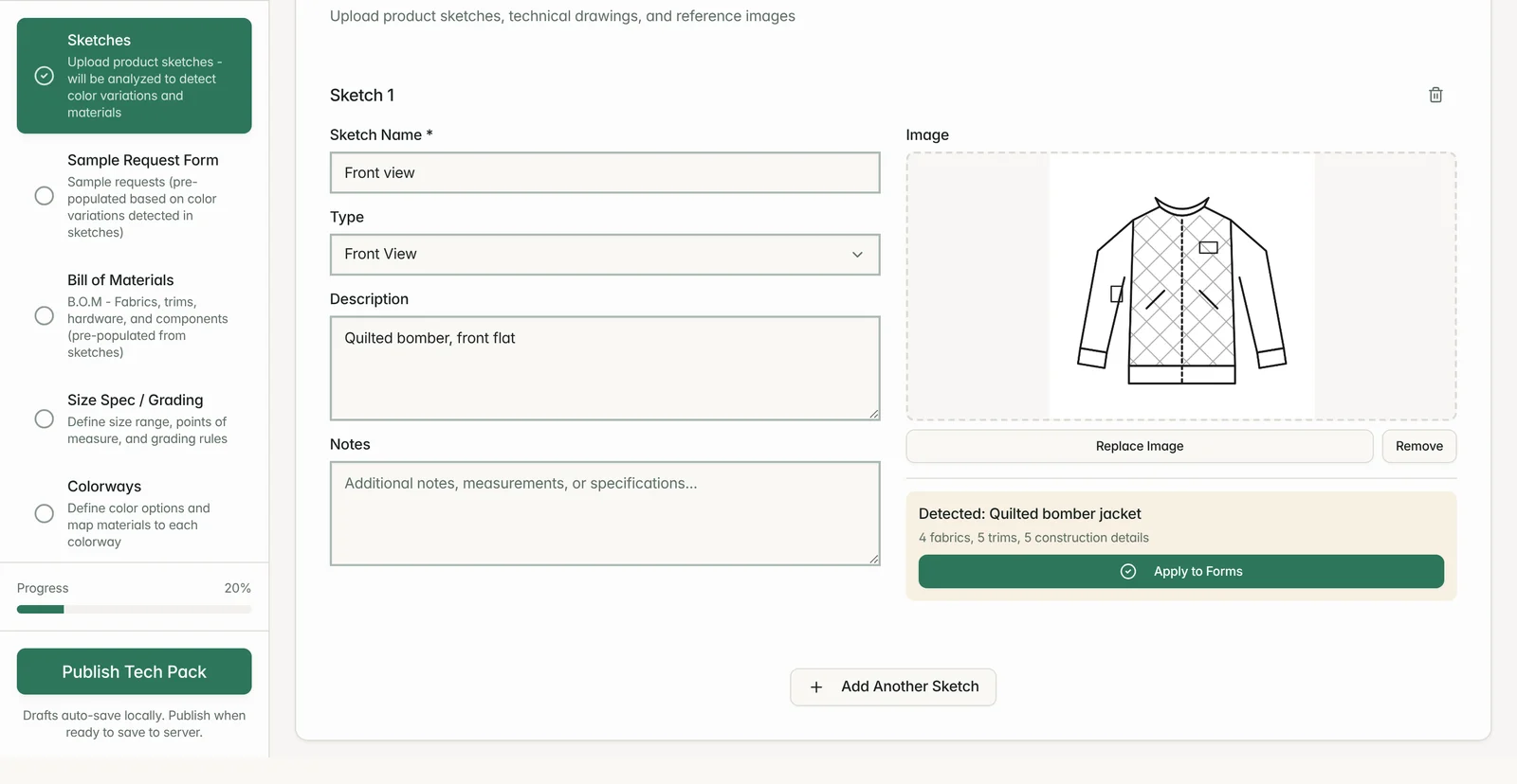
Tech Pack Builder on its Sketches step: a flat drawing of a quilted bomber jacket uploaded as the front view, with a panel reading Detected: Quilted bomber jacket, 4 fabrics, 5 trims, 5 construction details, and an Apply to Forms button. A sidebar lists the five steps: Sketches, Sample Request Form, Bill of Materials, Size Spec / Grading and Colorways.2025
Read the sketch. Drop in a flat and the tool lists the fabrics, trims and construction it can see, ready to apply to the forms.
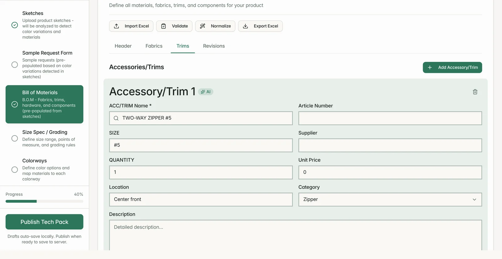
Bill of Materials step, Trims tab: Accessory/Trim 1 marked AI, a two-way #5 zipper at center front, quantity 1, category Zipper, with article number, supplier and price left for the designer.2025
The bill of materials. Each trim the sketch shows becomes a line, marked AI until someone checks it.
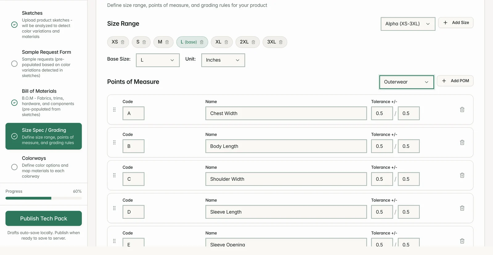
Size Spec / Grading step with an XS to 3XL size range, L as the base size, inches, and outerwear points of measure: chest width, body length, shoulder width, sleeve length, each with a half-inch tolerance.2025
Size and grading. A size range and points of measure, loaded from presets for outerwear.